


In short
A one-page website puts everything on a single page: one message, one path, one call to action. It is the fastest way to present a brand-new product or brand and to collect your first contacts. It does have limits, though, especially for SEO: here is when it makes sense and when you need a more structured website.
⏱ Reading time: 4 minutes
When time matters more than structure
A new product is ready, a brand is about to be born, a trade fair is just around the corner. At moments like these the question is not “how do we build the perfect website?” but “how do we get online quickly, with a message people understand straight away?”.
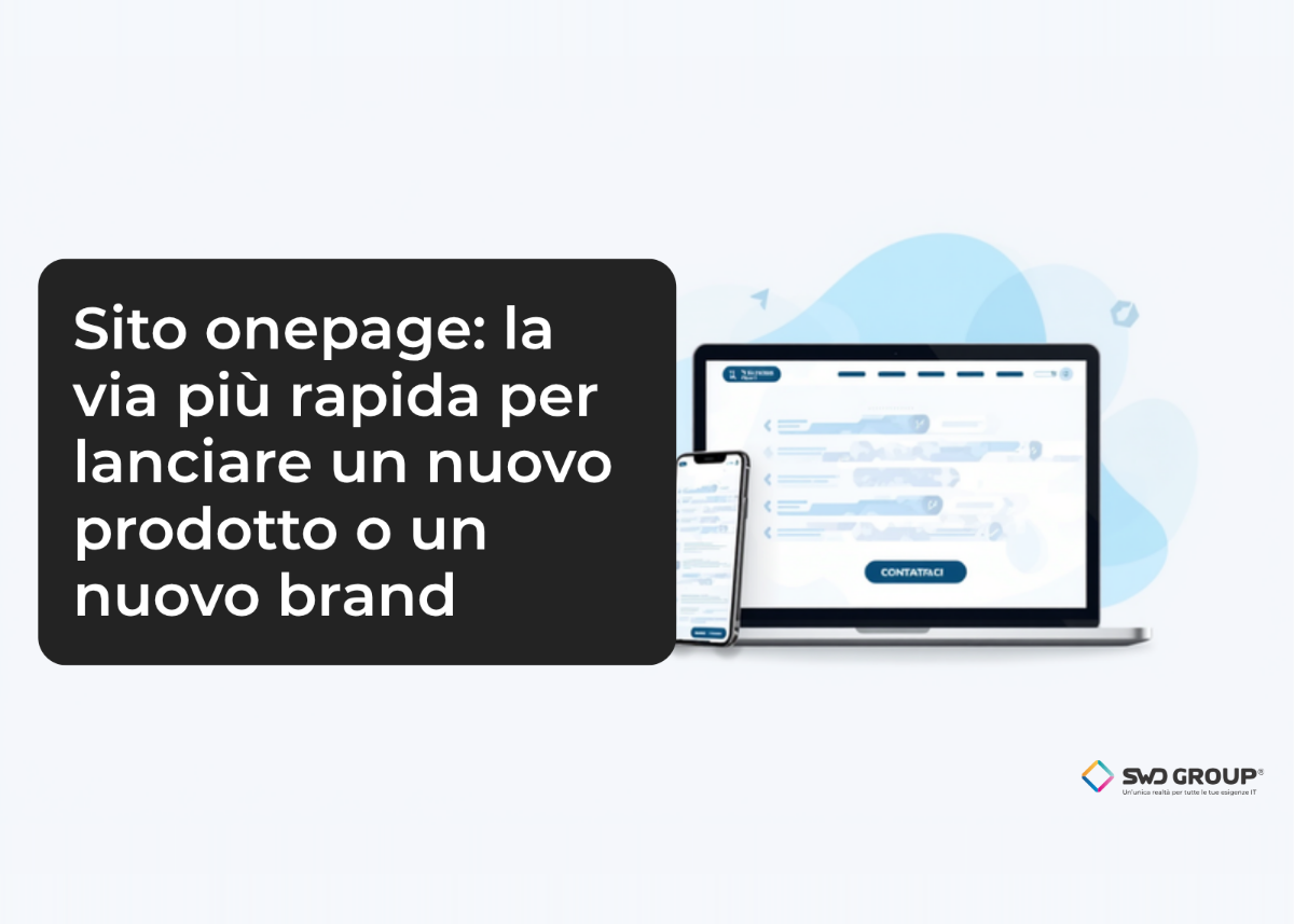
A one-page website meets exactly this need. All the content sits on a single page, divided into sections that are read from top to bottom. The menu does not open new pages: it takes you to the section you choose. Fewer pages to design means fewer texts to write, fewer decisions to make and a shorter time to go live.
Why it works: how we really read the web
People who land on a website rarely read all of it. A Nielsen Norman Group study estimated that on an average visit users read about 20% of the words on a page (Nielsen Norman Group, How Little Do Users Read?). The rest is scrolled past, scanned or skipped.
The device matters too. In Italy, as of September 2026, more than half of all web browsing happens on smartphones (51.8% according to Statcounter). On a phone the most natural gesture is scrolling down: exactly the way a one-page site is read.
A good one-page website starts from here: clear headings, short sentences and a logical order that takes visitors from the problem to the solution, all the way to getting in touch.
The psychology: one choice is easier
There is a psychological reason as well. The more options we have in front of us, the longer it takes us to decide, and sometimes we put the decision off altogether. Psychologists call this choice overload.
A one-page site lightens that load: one message, one path, one action to take, whether that is booking a demo, asking for a quote or sending an email. Visitors do not have to wonder where to click: there is one road, and it is clearly signposted.
Two examples of our own
We use this approach for our own products too:
- primocantiere.it: the platform for keeping construction site costs under control, presented on a single page that runs from the problem to the demo request (site in Italian).
- aibill.it: the accounting software for Italian healthcare professional bodies, with features, plans and demo booking in a single journey (site in Italian).
Among the sectors that can benefit most, we see start-ups and new brands, professional firms, creative agencies and anyone launching a product for a trade fair or a campaign: very different organisations, with the same need to be understood in a few seconds.
When a one-page website makes sense
A one-page website is the right choice when:
- you need to launch a new product, service or brand quickly;
- there is one message, and it is clear;
- the goal is to collect contacts or demo requests;
- you need a landing page for advertising campaigns or social media;
- you want a base to start from, set up from day one so that new pages can be added as the project grows.
When you need a multi-page website
To be honest, a one-page site is not right for everyone. A website with several pages is the better option when:
- your offer includes many different services or products, each with its own audience;
- you want to be found on Google for many different searches;
- you are planning a blog, online sales or content that needs frequent updates;
- the site has to meet specific obligations, such as those that apply to public administration websites;
- you need well-structured versions in several languages.
The SEO limits
The most delicate point is search ranking. On Google, each page competes mainly for one topic. A one-page site can rank well for the brand name and for a few keywords tied to the main message, but it will rarely cover dozens of different searches.
There are also technical aspects to look after: a long page full of images has to stay fast, and to understand which sections are working you need carefully configured analytics tools.
The good news is that a well-designed one-page site can grow, as long as you plan for it from the start. It is worth building it from day one on a structure ready to host sub-pages: a blog, product pages, pages for individual services or language versions. That way, as the project grows, you add pages without rebuilding the site and without losing what you have already achieved on Google, and the main page remains the starting point.
Where to start
Even before the design, you need three answers: who you are talking to, what you want them to understand and what you want them to do. If the answers are clear, a one-page site can be online in a short time and start bringing in contacts straight away.
Let’s talk
If you are getting ready to launch a product or a new brand, let’s work out together whether a one-page site is the right choice or whether it makes more sense to set up a larger website from the start.
Or write to me: posta@swdweb.it
Leonardo Pantaleo
CEO, SWD Group